Problem Statement
A consumer finance company specialises in lending various types of loans to urban customers. When the company receives a loan application, it has to make a decision for loan approval based on the applicant’s profile. Two types of risks are associated with the bank’s decision:
If the applicant is likely to repay the loan, then not approving the loan results in a loss of business to the company
If the applicant is not likely to repay the loan, i.e. he/she is likely to default, then approving the loan may lead to a financial loss for the company
The aim is to identify patterns which indicate if a person is likely to default, which may be used for taking actions such as denying the loan, reducing the amount of loan, lending (to risky applicants) at a higher interest rate, etc.
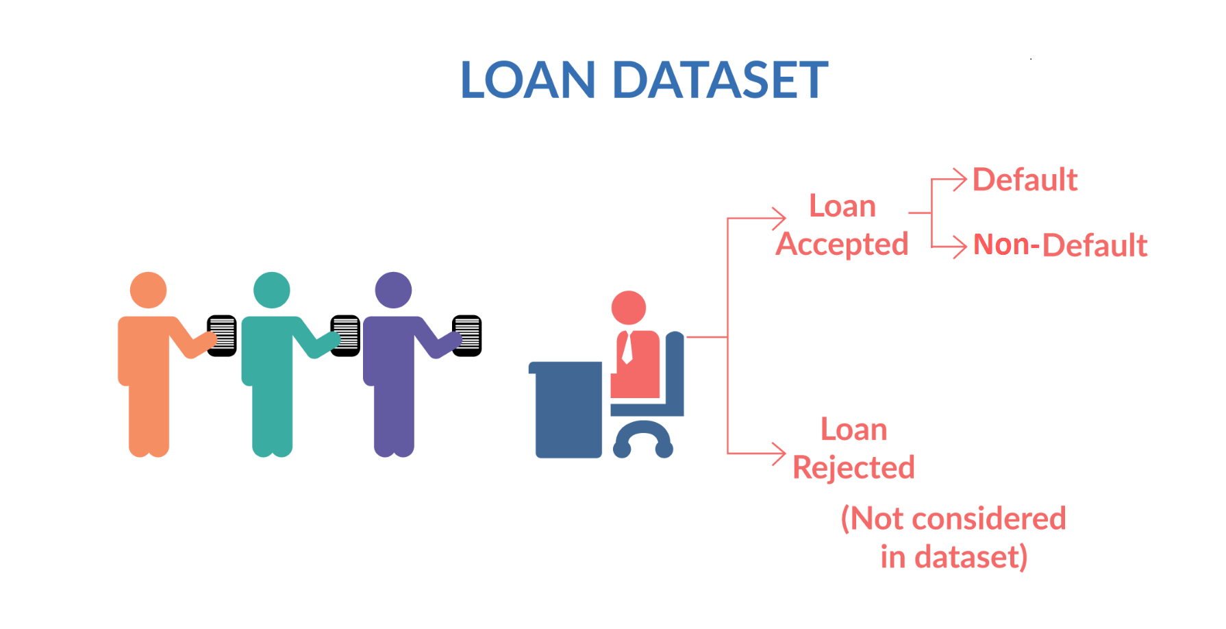
When a person applies for a loan, there are two types of decisions that could be taken by the company:
Loan accepted: If the company approves the loan, there are 3 possible scenarios described below:
Fully paid: Applicant has fully paid the loan (the principal and the interest rate)
Current: Applicant is in the process of paying the instalments, i.e. the tenure of the loan is not yet completed. These candidates are not labelled as 'defaulted'.
Charged-off: Applicant has not paid the instalments in due time for a long period of time, i.e. he/she has defaulted on the loan
Loan rejected: The company had rejected the loan (because the candidate does not meet their requirements etc.). Since the loan was rejected, there is no transactional history of those applicants with the company and so this data is not available with the company (and thus in this dataset)
# importing required modules
import pandas as pd
import numpy as np
import datetime as dt

import matplotlib.pyplot as plt
import seaborn as sns

pd.set_option('display.max_rows', 500)
pd.set_option('display.max_columns', 500)
pd.set_option('display.width', 1000)

plt.style.use('ggplot')
# importing dataset
df = pd.read_csv("D:\\DataSets\\UPGRAD\\Assignments\\Loan Group Project\\loan.csv", low_memory=False)
df.info()
df.describe()
# Display percentage of NA Values for every column (columns with 100% NA values will be discarded)
print("Percentage of NA Values for every column")
print(round(df.isna().sum() / len(df) * 100, 2))
# Finding columns with a single occuring value
for col in df.columns:
    if df[col].nunique() == 1:
        print(col, df[col].nunique())
Data Cleaning
# Remove duplicate rows
df.drop_duplicates(inplace=True)
# Removing columns with single occuring values
drop_cols = [col for col in df.columns if df[col].isna().all()]
df.drop(drop_cols, axis=1, inplace=True)
# Dropping columns where ALL values are NA
na_columns = [col for col in df.columns if df[col].nunique() < 2]
df.drop(na_columns, axis=1, inplace=True)
# Drop other unnecessary columns
drop_cols = ['member_id', 'url', 'title', 'desc', 'zip_code']
df.drop(drop_cols, axis=1, inplace=True)
# Removing % sign and converting to float for 'int_rate', 'revol_util'
df['int_rate'], df['revol_util'] = df['int_rate'].str.replace('%', '').astype(float), df['revol_util'].str.replace('%', '').astype(float)
# changing strings to standard format
cols = ['term', 'emp_title', 'home_ownership', 'verification_status', 'loan_status', 'purpose']
for col in cols:
    df[col] = df[col].str.strip().str.lower().str.replace(' ', '_')
# If pub_rec_bankruptcies is not known we assume there are no public records.
df['pub_rec_bankruptcies'].fillna(0, inplace=True)
df['pub_rec_bankruptcies'] = df['pub_rec_bankruptcies'].astype(int)
# Change data type from string to datetime for all columns with dates
cols = ['issue_d', 'earliest_cr_line', 'last_pymnt_d', 'next_pymnt_d', 'last_credit_pull_d']
for col in cols:
    df[col] = pd.to_datetime(df[col], format='%b-%y')
df.head()
Feature Extraction
Creating 'defaulted' column
# Creating binary column "defaulted" -> States whether that borrower defaulted on particular loan
df['defaulted'] = 0
df.loc[df['loan_status'] == 'charged_off', 'defaulted'] = 1
Creating 'issue_year', 'issue_month'
# Creating columns for "Issue Year", "Issue Month" -> (Year and month of issue of loan)
df['issue_year'] = df['issue_d'].dt.year
df['issue_month'] = df['issue_d'].dt.month
Placing borrower's income into categories
Annual_inc: This is the annual salary of the borrower in question.
plt.figure(figsize = (12, 6))
plt.subplot(121)

df['annual_inc'].hist(color='k')
plt.xlabel("Income", fontsize=12)
plt.ylabel("Count", fontsize=12)

plt.subplot(122)
df['annual_inc'].plot(kind='box', logy=True)

plt.tight_layout()
plt.show()

print(df['annual_inc'].describe())

Above histogram is not clearly represented due to outliers. By removing outliers from the visualisation we can get a clearer picture of how income is distributed.
plt.figure(figsize = (12, 6))
plt.subplot(121)

df[df['annual_inc'] < 400000]['annual_inc'].hist(color='k')
plt.xlabel("Income", fontsize=12)
plt.ylabel("Count", fontsize=12)

plt.subplot(122)
df[df['annual_inc'] < 400000]['annual_inc'].plot(kind='box')

plt.tight_layout()
plt.show()

# Low Income: 100000 or less, Mid Income: Between 100000 to 200000, high Income: Above 200000
df['inc_cat'] = 'mid_inc'
df.loc[df['annual_inc'] <= 100000, 'inc_cat'] = 'low_inc'
df.loc[df['annual_inc'] > 200000, 'inc_cat'] = 'high_inc'

Grouping the states into regions
United States are grouped into 5 Major Regions according to this information -> https://en.wikipedia.org/wiki/List_of_regions_of_the_United_States
# Grouping the states into regions -> North_east, South_East, South_West, Mid_West, West
def finding_regions(state):
    north_east = ['CT', 'NY', 'PA', 'NJ', 'RI','MA', 'MD', 'VT', 'NH', 'ME']
    south_west = ['AZ', 'TX', 'NM', 'OK']
    south_east = ['GA', 'NC', 'VA', 'FL', 'KY', 'SC', 'LA', 'AL', 'WV', 'DC', 'AR', 'DE', 'MS', 'TN' ]
    west = ['CA', 'OR', 'UT','WA', 'CO', 'NV', 'AK', 'MT', 'HI', 'WY', 'ID']
    mid_west = ['IL', 'MO', 'MN', 'OH', 'WI', 'KS', 'MI', 'SD', 'IA', 'NE', 'IN', 'ND']

    if state in west:
        return 'west'
    elif state in south_west:
        return 'south_west'
    elif state in south_east:
        return 'south_east'
    elif state in mid_west:
        return 'mid_west'
    elif state in north_east:
        return 'north_east'


df['region'] = np.nan
df['region'] = df['addr_state'].apply(finding_regions)
df.head()
EDA
Loan_amnt: The loan amount requested by the borrower/applicant.
# Distribution Of Loan Amount

plt.figure(figsize=(12,6))

plt.subplot(121)
g = sns.distplot(df["loan_amnt"], bins=12)
g.set_xlabel("", fontsize=12)
g.set_ylabel("Frequency Dist", fontsize=12)
g.set_title("Frequency Distribuition", fontsize=20)

plt.subplot(122)
g1 = sns.violinplot(y="loan_amnt", data=df,
               inner="quartile", palette="pastel")
g1.set_xlabel("", fontsize=12)
g1.set_ylabel("Amount Dist", fontsize=12)
g1.set_title("Amount Distribuition", fontsize=20)

plt.show()

Loan Status: This tells us whether the loan has been successfully paid off, has been written off (borrower has defaulted), or is currently in process.
# Count of Loan Statuses
with plt.style.context('ggplot'):
    plt.figure(figsize = (14, 8))

    plt.subplot(121)
    x = df['loan_status'].unique()
    y = [len(df[df.loan_status == cat]) for cat in x]
    plt.title("Count of Loan Status", fontsize=16)
    plt.ylabel("Count", fontsize=12)
    plt.bar(x, y, color='xkcd:blue green')

    plt.subplot(122)
    g = sns.countplot(x='issue_year', data=df,
                      hue='loan_status', palette='Set2')
    g.set_xticklabels(g.get_xticklabels(),rotation=90)
    g.set_xlabel("Year", fontsize=12)
    g.set_ylabel("Count", fontsize=12)
    g.legend(loc='upper left')
    g.set_title("Loan Status by Year", fontsize=16)

    plt.tight_layout()
    plt.show()

# Count of 'income by category'
with plt.style.context('ggplot'):
    plt.figure(figsize = (10,12))

    x = df['inc_cat'].unique()
    y = np.array([len(df[df.inc_cat == cat]) for cat in x])
    y2 = np.array([len(df[(df.inc_cat == cat) & (df.defaulted == 1)]) for cat in x])

    plt.ylabel("Count", fontsize=12)
    plt.bar(x, y, width=0.4, color='k')
    plt.bar(x, y2, width=0.4, color='xkcd:blue green')
    plt.legend(labels=["Total", "Defaulted"])
    plt.show()

    print("Ratio of defaulted to total for each income category:")
    for inc_cat, pct in zip(x, y2/y):
        print(f"{inc_cat}: {round(pct*100, 2)}", end='\t')

Most borrowers belong in the low income category, just the defaulters make up for all borowers in the mid_income category.
Grade: This is a grade assigned to a borrower depending on their credit history and likelyhood of repayment of loan. The better the grade, the lesser the interest rates on the loan.
Sub Grade: Grades can further be divided into subgrades based on finer margins.
# Count of Grade and sub Grade

plt.figure(figsize = (14,8))

x = sorted(df['grade'].unique())
y = np.array([len(df[df.grade == cat]) for cat in x])
y2 = np.array([len(df[(df.grade == cat) & (df.defaulted == 1)]) for cat in x])

plt.bar(x, y, color='k')
plt.bar(x, y2, color='xkcd:blue green')
plt.ylabel("Count", fontsize=12)
plt.legend(labels=["Total", "Defaulted"])
plt.show()

print("Ratio of defaulted to total for each grade:")
for grade, pct in zip(x, y2/y):
    print(f"{grade}: {round(pct*100, 2)}", end='\t')

plt.figure(figsize = (14,8))
x = sorted(df['sub_grade'].unique())
y = [len(df[df.sub_grade == cat]) for cat in x]
y2 = [len(df[(df.sub_grade == cat) & (df.defaulted == 1)]) for cat in x]
plt.xticks(rotation='vertical', fontsize=12)
plt.ylabel("Count", fontsize=12)
plt.bar(x, y, color='k')
plt.bar(x, y2, color='xkcd:blue green')
plt.legend(labels=["Total", "Defaulted"])
plt.show()


Although grade B and C loans have higher number of defaults, the highest default ratios are for grade F and G.
Below, we check how income is distributed among borrowers in bottom 3 grades E, F, G
# how income is distributed among borrowers in grade E, F, G
sub_df = df[(df['grade'] == 'E') | (df['grade'] == 'F') | (df['grade'] == 'G')]

plt.figure(figsize = (10,12))

x = sub_df['inc_cat'].unique()
y = np.array([len(sub_df[sub_df.inc_cat == cat]) for cat in x])
y2 = np.array([len(sub_df[(sub_df.inc_cat == cat) & (sub_df.defaulted == 1)]) for cat in x])

plt.ylabel("Count", fontsize=12)
plt.bar(x, y, width=0.4, color='k')
plt.bar(x, y2, width=0.4, color='xkcd:blue green')
plt.legend(labels=["Total", "Defaulted"])
plt.show()

print("Ratio of defaulted to total for each income category:")
for inc_cat, pct in zip(x, y2/y):
    print(f"{inc_cat}: {round(pct*100, 2)}", end='\t')

Finding high income individuals with a bad grade is uncommon. 28.5% of all low income borrowers from categories E, F, G tend to default.
Verification Status: This indicates at what level the income of the borrower was verified.
# Count of verification Status
plt.figure(figsize = (10,8))

x = df['verification_status'].unique()
y = [len(df[df.verification_status == cat]) for cat in x]
y2 = [len(df[(df.verification_status == cat) & (df.defaulted == 1)]) for cat in x]

plt.bar(x, y, color='k')
plt.bar(x, y2, color='xkcd:blue green')
plt.legend(labels=["Total", "Defaulted"])
plt.show()

No distinguishable characteristics exist between above categories.
Term: Indicates number of payments the loan is divided into. It can either be 36 or 60.
# Count of Term
plt.figure(figsize = (10,8))

x = df['term'].unique()
y = [len(df[df.term == cat]) for cat in x]
y2 = [len(df[(df.term == cat) & (df.defaulted == 1)]) for cat in x]
plt.bar(x, y, width=0.4, color='k')
plt.bar(x, y2, width=0.4, color='xkcd:blue green')
plt.legend(labels=["Total", "Defaulted"])
plt.show()

pub_rec_bankruptcies: Public record of number of times borrower as filed for bankruptcy.
# Bankruptcies
plt.figure(figsize = (12,10))

x = ['0', '1', '2']
y = [len(df[df.pub_rec_bankruptcies == int(cat)]) for cat in x]
y2 = [len(df[(df.pub_rec_bankruptcies == int(cat)) & (df.defaulted == 1)]) for cat in x]
plt.bar(x, y, width=0.4, color='k')
plt.bar(x, y2, width=0.4, color='xkcd:blue green')
plt.legend(labels=["Total", "Defaulted"])
plt.show()

emp_title: Indicates who the employer of the borrower is.
# Count of top 20 employment titles
emp_df = df.groupby('emp_title', as_index=False).agg({'id': 'count', 'defaulted': 'sum'}).sort_values('id', ascending=False).head(20)
plt.figure(figsize=(12,6))

x = emp_df['emp_title']
y = emp_df['id']
y2 = emp_df['defaulted']

plt.xticks(rotation='vertical', fontsize=12)
plt.bar(x, y, color='k')
plt.bar(x, y2, color='xkcd:blue green')
plt.legend(labels=["Total", "Defaulted"])
plt.show()

print("Ratio of defaulted to total seggregated by employment:")
for emp, pct in zip(x, y2/y):
    print(f"{emp}: {round(pct*100, 2)}")

Most number of borrowers are employed at the US Army followed by Bank Of America, but highest default ratios are from employees of:
UPS: 27%
WALMART: 24.4%
US POSTAL: 22.22%
emp_length: Number of years the borrower has spent in the work force.
# Count of borrowers seggregated by length of employment
emp_df = df.groupby('emp_length', as_index=False).agg({'id': 'count', 'defaulted': 'sum'}).sort_values('id', ascending=False)
plt.figure(figsize=(12,10))

x = emp_df['emp_length']
y = emp_df['id']
y2 = emp_df['defaulted']

plt.xticks(rotation='vertical', fontsize=12)
plt.bar(x, y, color='k')
plt.bar(x, y2,color='xkcd:blue green')
plt.legend(labels=["Total", "Defaulted"])
plt.show()

print("Ratio of defaulted to total seggregated by years of employment:")
for emp, pct in zip(x, y2/y):
    print(f"{emp}: {round(pct*100, 2)}")

Purpose: Purpose of taking a loan
# Most frequently stated reasons
emp_df = df.groupby('purpose', as_index=False).agg({'id': 'count', 'defaulted': 'sum'}).sort_values('id', ascending=False).head(20)
plt.figure(figsize=(12,10))

x = emp_df['purpose']
y = emp_df['id']
y2 = emp_df['defaulted']

plt.xticks(rotation='vertical', fontsize=12)
plt.bar(x, y, color='k')
plt.bar(x, y2, color='xkcd:blue green')
plt.legend(labels=["Total", "Defaulted"])
plt.show()

print("Ratio of defaulted to total seggregated by purpose:")
for purpose, pct in zip(x, y2/y):
    print(f"{purpose}: {round(pct*100, 2)}")

print(f"\n\nDebt consolidation is the most common reason to take a loan and makes up for {round(len(df[df['purpose'] == 'debt_consolidation'])/len(df)*100, 2)}% of client base")

Highest default ratio exist for the small_buisness (26%) followed by renewable_energy (18.5%)
# Count of loans per state and region

state_df = df.groupby('addr_state', as_index=False).agg({'id': 'count', 'defaulted': 'sum'}).sort_values('id', ascending=False)
plt.figure(figsize=(16,8))

x = state_df['addr_state']
y = state_df['id']
y2 = state_df['defaulted']
plt.xticks(rotation='vertical', fontsize=12)
plt.bar(x, y, color='k')
plt.bar(x, y2,color='xkcd:blue green')
plt.legend(labels=["Total", "Defaulted"])
plt.show()

print("California (CA) is the state with highest number of borrowers at 7000 followed by New York (NY) at around 4000")

region_df = df.groupby('region', as_index=False).agg({'id': 'count', 'defaulted': 'sum'}).sort_values('id', ascending=False)
plt.figure(figsize=(16,6))

x = region_df['region']
y = region_df['id']
y2 = region_df['defaulted']
plt.xticks(fontsize=12)
plt.bar(x, y, color='k')
plt.bar(x, y2,color='xkcd:blue green')
plt.legend(labels=["Total", "Defaulted"])
plt.show()

print("Ratio of defaulted to total seggregated by geographical region:")
for region, pct in zip(x, y2/y):
    print(f"{region}: {round(pct*100, 2)}")


Installments: Monthly payment owed by the borrower.
# distribution of installments
plt.figure(figsize=(14,10))

sns.distplot(df['installment'], color='k')
sns.distplot(df[df['defaulted'] == 1]['installment'],color='xkcd:blue green')
plt.legend(['Total', 'defaulted'])
plt.show()

Int_rate: The interest rate on the loan issued
#distribution of int_rate
plt.figure(figsize=(14,10))

sns.distplot(df['int_rate'])
sns.distplot(df[df['defaulted'] == 1]['int_rate'])
plt.legend(['Total', 'defaulted'])
plt.show()

# avg interest rate per year
by_interest = df.groupby(['issue_year', 'defaulted']).int_rate.mean()

by_interest.unstack().plot()
plt.title('Average Interest rate by Loan Condition', fontsize=14)
plt.ylabel('Interest Rate (%)', fontsize=12)
plt.show()

On average, defaulters tend to have higher interest rates on their loans. This is likely due to the fact that their score/grade is low (thus a higher interest rate)
total_rec_prncp: Principal amount recieved from borrower till date.
# total_rec_prncp vs installment
plt.figure(figsize=(12, 8))
sns.scatterplot(data=df, x='total_rec_prncp', y='installment', hue='loan_status', palette='Set1')
plt.show()

total_pymnt: Payment recieved from borrower till date.
# total_rec_prncp vs total_pymnt
plt.figure(figsize=(12, 8))
sns.scatterplot(data=df, x='total_rec_prncp', y='total_pymnt', hue='loan_status', palette='Set1')
plt.show()

total_rec_int: Interests recieved from borrower till date
# total_rec_int vs total_pymnt
plt.figure(figsize=(12, 8))
sns.scatterplot(data=df, x='total_rec_int', y='total_pymnt', hue='loan_status', palette='Set1')
plt.show()

Heatmap
Heatmmap will visually tell how the relevant features are correlated.
numeric_variables = df[['loan_amnt','funded_amnt','funded_amnt_inv','int_rate','installment','annual_inc','dti','delinq_2yrs','inq_last_6mths', 'open_acc','pub_rec','revol_bal','revol_util','total_acc', 'out_prncp','out_prncp_inv','total_pymnt','total_pymnt_inv','total_rec_prncp','total_rec_int','total_rec_late_fee','recoveries','collection_recovery_fee','last_pymnt_amnt', 'defaulted']]

plt.figure(figsize=(14, 10))
sns.heatmap(numeric_variables.corr(), cmap='RdYlGn', annot=True)
plt.show()

Summary
Five significant predictors of a borrower defaulting are:
Income:
Borrowers from the 'Low Income' category make up for 85.68% of the client base of loanees, which is an overwhelming majority. 15% of these tend to default their loan. Probability to default is 4% more in case of low income borrowers compared to mid and high income. 28.5% of all low income, bad grade (E, F, G) borrowers tend to default.
Grade:
Grade and rate of default are heavily inversely correlated. The highest default ratios are present for the three worst grades namely G: 31.96% F: 30.41% E: 25.16%
Interest Rate:
There's a 20% positive correlation between interest rate and tendency to default. Interest rate is heavily correlated with grade as better the grade, lesser the interest rate. Therefore borrowers without a good grade (A, B) will recieve higher interest rates that decrease their chance of paying of their loan. (Thus increase chance of default.)
Total Reccuring Principal:
There is a strong negative correlation (34%) between Total Reccuring Principal and tendency to default. This effect can be seen that defaulters usually have higher installment charges and higher total payments for an increasing value of TRP.
Purpose of Loan:
47% of borrowers stated 'Debt Consolidation' as pupose of loan and make up the majority of borrowers. The purpose with the highest default ratio is 'Small Buisness' (26%) followed by 'Renewable Energy' (18%).